
WCAG Criteria
Form Labels and Error Messages: WCAG Audit Checklist
A practical WCAG audit checklist for form labels and error messages, covering visible labels, accessible names, instructions, required fields, error identification, suggestions, focus handling, and retesting.
Quick answer: what should a WCAG form audit check?
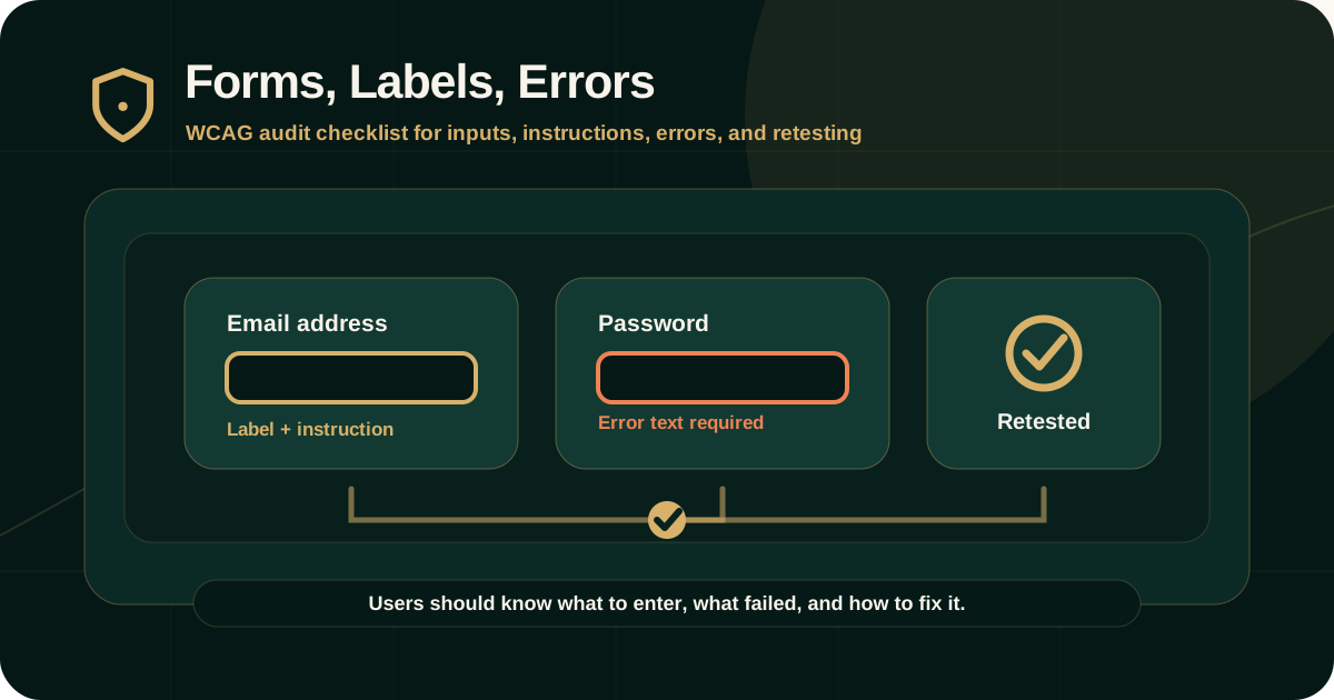
A WCAG form audit should check whether every input has a clear visible label or instruction, whether labels are programmatically associated with fields, whether required fields and input formats are communicated, and whether errors are identified in text with enough information to correct them.
The audit should also check focus behavior, keyboard operation, accessible names, grouped controls, error summaries, dynamic validation, screen reader announcements, and retest evidence after remediation.
Why labels and errors matter
Forms are where users complete important tasks: creating accounts, requesting audits, submitting payments, applying for services, downloading documents, filing complaints, and updating personal information.
If labels and errors are unclear, missing, or not exposed to assistive technologies, users may not know what to enter, which field failed, or how to recover.
- Screen reader users need programmatic names and relationships.
- Keyboard users need predictable focus movement after errors.
- Low-vision users need visible labels, visible errors, and enough contrast.
- Users with cognitive or language disabilities need clear instructions and helpful correction text.
- All users benefit when forms explain requirements before and after validation.
Key WCAG criteria involved
Form accessibility usually maps to several WCAG criteria. A single field can fail more than one requirement if the visible label, programmatic name, required-state communication, and error behavior are all weak.
A serious audit should map each finding to the relevant criterion rather than using a generic form accessibility label.
- 1.3.1 Info and Relationships: labels, groups, instructions, and relationships should be programmatically determinable where needed.
- 2.4.6 Headings and Labels: headings and labels should describe topic or purpose.
- 3.3.1 Error Identification: automatically detected input errors should identify the item in error and describe the error in text.
- 3.3.2 Labels or Instructions: labels or instructions should be provided when content requires user input.
- 3.3.3 Error Suggestion: suggestions should be provided when an input error is detected and suggestions are known, unless doing so would compromise security or purpose.
- 3.3.4 Error Prevention: for legal, financial, data, or test responses, users may need review, confirmation, or reversibility.
- 4.1.2 Name, Role, Value: custom controls and inputs should expose programmatic names, roles, states, and values.
Labels and instructions
W3C explains that labels or instructions help users know what information to enter. Labels should be visible where possible and specific enough to identify the input's purpose.
Instructions should explain expected formats, constraints, required fields, examples, and rules before users submit the form, especially where errors are likely.
- Every text input, select, checkbox, radio button, switch, slider, upload field, and custom input should have a clear label.
- Do not rely only on placeholder text as the label.
- Required fields should be identified in text, not only by color or icon.
- Expected formats should be provided before submission, such as date, phone, password, file type, or ID number.
- Radio buttons and checkboxes should be grouped with a descriptive legend or equivalent relationship.
Programmatic label relationships
A visible label is not enough if assistive technologies cannot determine which field the label belongs to. The programmatic relationship should be correct.
Native HTML label associations are usually more reliable than custom scripting. ARIA can help in specific cases, but it should not be used to cover avoidable markup mistakes.
- Use label elements with correct for and id relationships for standard inputs.
- Use fieldset and legend for related radio buttons and checkboxes where appropriate.
- Use aria-labelledby or aria-describedby only when the relationship is intentionally managed and tested.
- Ensure visible labels and accessible names are consistent.
- Check that required, invalid, disabled, expanded, selected, and checked states are exposed where relevant.
Error identification
WCAG 3.3.1 requires automatically detected input errors to identify the item in error and describe the error in text. W3C explains that simply redisplaying a form after failed submission is not enough.
The error message should help users understand what went wrong and where to fix it.
- Identify the field that has the error.
- Describe the error in text.
- Do not rely only on red borders, icons, vibration, or color.
- Keep error messages visible until the user can act on them.
- Ensure screen readers can discover or hear the error.
- Avoid generic messages such as invalid input when more detail is available.
Error suggestions
WCAG 3.3.3 Error Suggestion is a Level AA requirement. If an input error is detected and suggestions are known, the suggestion should be provided unless it would compromise security or the purpose of the content.
Good error suggestions reduce repeated failed submissions and help users recover more quickly.
- Explain the expected format, such as use DD/MM/YYYY.
- Explain missing requirements, such as include at least one number.
- Suggest correction when the allowed value or range is known.
- Avoid blaming language.
- Do not reveal sensitive security information in a way that creates risk.
- Do not force users to guess which field caused the problem.
Focus handling after validation
WCAG does not require one single focus pattern for all forms, but focus behavior affects whether users can recover from errors efficiently.
A useful form should help users discover errors and reach the fields that need attention without losing context.
- After failed submission, move focus to an error summary or first invalid field where appropriate.
- If an error summary is used, provide links to the affected fields.
- Ensure focus does not move unexpectedly while users are typing.
- Ensure dynamic validation messages are announced or discoverable.
- Do not trap focus in the form or error message.
- Retain user-entered data unless there is a valid security reason not to.
How auditors test form labels and errors
A WCAG form audit should test the form visually, with keyboard navigation, with screen reader checks where relevant, and through validation states.
The form should be tested before submission, after missing required fields, after invalid formats, after server-side errors, and after successful submission.
- Check every input's visible label and accessible name.
- Check instructions, required-field indicators, and input format guidance.
- Use Tab, Shift+Tab, Enter, Space, and arrow keys where relevant.
- Submit empty and invalid forms to trigger errors.
- Check whether errors are shown in text and associated with affected fields.
- Check whether screen readers announce or can discover the error.
- Check mobile and responsive layouts, because labels and error placement may change.
What evidence should appear in the report
Form findings should be documented with enough detail for product, design, engineering, QA, content, and compliance teams to fix and retest the issue.
A vague finding such as form is inaccessible is not enough.
- Affected URL, screen, form, field, state, or workflow.
- Field label, accessible name, and visible instruction issue.
- Validation scenario used to trigger the error.
- Expected behavior and actual behavior.
- WCAG criterion and level.
- Screenshot, keyboard path, screen reader note, DOM or accessibility-tree evidence where useful.
- User impact, severity, remediation guidance, and retest method.
Common failures
Form failures often appear in custom components, fast-moving product forms, payment flows, search filters, account settings, uploaded documents, and marketing forms.
They also occur when labels are visually designed but not programmatically connected.
- Placeholder text used as the only label.
- Label visible but not associated with the input.
- Required field indicated only by color or asterisk without explanation.
- Error identified only by red border.
- Error summary not linked to fields.
- Screen reader does not announce the invalid field or error.
- Format requirements appear only after failed submission.
- Custom select, combobox, date picker, or upload component has missing name, role, state, or value.
Remediation guidance
Form remediation should fix the design pattern and implementation, not only one field. Reusable forms, design-system components, and validation utilities should be corrected at the source.
Use native HTML patterns where possible and test custom components carefully.
- Use visible labels for inputs wherever possible.
- Associate labels programmatically with fields.
- Group related fields with fieldset and legend or equivalent semantics.
- Provide format instructions before users submit.
- Use clear, text-based error messages.
- Associate errors with affected fields.
- Provide helpful error suggestions where possible.
- Retest with keyboard and screen reader after remediation.
Retesting form fixes
Retesting should repeat the original form path and validation scenario. A code merge is not enough to close a form accessibility finding.
The retest should verify both visual behavior and assistive technology behavior where relevant.
- Original finding ID and form state.
- Field label and accessible name after remediation.
- Required-field and instruction visibility.
- Validation scenario retested.
- Error message text and field association.
- Keyboard path and focus behavior.
- Screen reader observation where relevant.
- Retest status and remaining risk.
Practical recommendation
Treat forms as critical user journeys. A form is accessible only when users can understand what is required, enter information, identify and fix errors, and complete the task using their preferred input and assistive technology.
For audits, test labels, instructions, required fields, errors, focus, keyboard support, and screen reader behavior together instead of checking each field in isolation.
Official references used
W3C Understanding 3.3.2 Labels or Instructions: https://www.w3.org/WAI/WCAG22/Understanding/labels-or-instructions.html
W3C Understanding 3.3.1 Error Identification: https://www.w3.org/WAI/WCAG22/Understanding/error-identification.html
W3C Understanding 3.3.3 Error Suggestion: https://www.w3.org/WAI/WCAG22/Understanding/error-suggestion.html
W3C Understanding 1.3.1 Info and Relationships: https://www.w3.org/WAI/WCAG22/Understanding/info-and-relationships.html
W3C Understanding 4.1.2 Name, Role, Value: https://www.w3.org/WAI/WCAG22/Understanding/name-role-value.html