
WCAG Criteria
Focus Indicators in WCAG 2.2: What Teams Need to Fix
A practical guide to WCAG 2.2 focus indicator requirements, covering Focus Visible, Focus Not Obscured, Focus Appearance, contrast, audit evidence, remediation, and retesting.
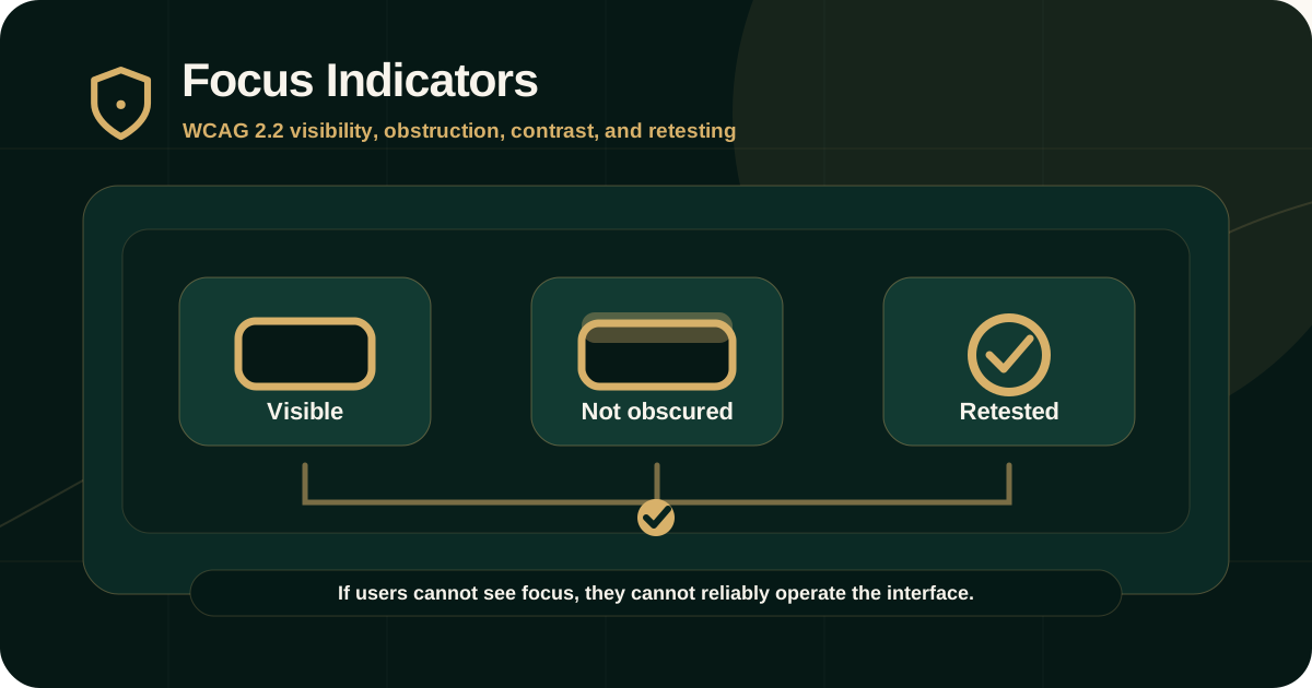
Quick answer: what does WCAG 2.2 require for focus indicators?
WCAG requires keyboard focus to be visible when users navigate with a keyboard. In WCAG 2.2, Focus Visible remains a Level AA requirement, and Focus Not Obscured (Minimum) is added at Level AA to ensure the focused component is not entirely hidden by author-created content.
Focus Appearance is a Level AAA criterion that gives stronger guidance about the size and contrast of the focus indicator. Even when AAA is not the audit target, it is useful design guidance for creating robust focus styles.
Why focus indicators matter
Focus indicators show sighted keyboard users where they are on the page. Without a visible focus indicator, users may not know which link, button, field, menu item, tab, or custom control will respond to their next key press.
Focus indicators are critical for keyboard users, screen reader users with some vision, switch users, voice-input users, people with attention or memory limitations, and anyone navigating without a mouse.
- Users need to know which control currently has keyboard focus.
- Users need to see focus while moving through forms, menus, modals, and dynamic components.
- Focus should remain visible long enough to guide the next action.
- Focus should not be hidden behind sticky headers, cookie banners, overlays, or dialogs.
- Custom components need focus behavior as carefully designed as their hover behavior.
WCAG 2.4.7 Focus Visible
WCAG Success Criterion 2.4.7 Focus Visible is a Level AA requirement. W3C explains that any keyboard-operable user interface must have a mode of operation where the keyboard focus indicator is visible.
This means teams should not remove browser focus outlines without providing an equal or better visible replacement.
- Links should show a visible focus state.
- Buttons and form controls should show visible focus.
- Custom controls should show focus as clearly as native controls.
- Focus indication should remain visible while focus is on the component.
- Using CSS to remove outlines without replacement is a common failure.
WCAG 2.4.11 Focus Not Obscured (Minimum)
WCAG 2.2 adds Success Criterion 2.4.11 Focus Not Obscured (Minimum) at Level AA. W3C explains that when a user interface component receives keyboard focus, the component must not be entirely hidden due to author-created content.
This matters because modern layouts often use sticky headers, sticky footers, cookie banners, chat widgets, non-modal overlays, and fixed-position panels that can cover the focused item.
- A sticky header should not fully cover a focused link or form field.
- A cookie banner should not entirely hide the focused component behind it.
- An overlay should not make the focused component impossible to identify.
- Scroll positioning should account for fixed headers and footers.
- Modal and non-modal dialog behavior should be tested with keyboard navigation.
Focus Appearance and stronger design targets
WCAG 2.4.13 Focus Appearance is a Level AAA criterion. It gives more specific expectations for the size and contrast of the focus indicator.
Even when a project targets AA, product teams can use Focus Appearance as a quality benchmark. A stronger focus indicator reduces confusion and makes keyboard use more reliable.
- Use a focus indicator that is clearly visible against adjacent colors.
- Avoid relying only on subtle shadows or faint color changes.
- Make focus styles consistent across components.
- Use at least one strong visual cue such as outline, border, underline, background, or shape change.
- Test focus styles in light mode, dark sections, images, cards, overlays, and disabled-looking states.
Focus indicators and non-text contrast
W3C's Focus Visible guidance notes that focus indicators are visual information used to identify the focused state of a user interface component, which means they may also be subject to WCAG 1.4.11 Non-text Contrast.
In practice, a focus ring that technically appears but is too faint to identify may still create an accessibility barrier.
- Focus rings should have enough contrast against adjacent colors.
- Focus indicators should be visible on dark, light, patterned, and image backgrounds.
- Do not rely only on color differences that are too subtle.
- Hover styles should not replace keyboard focus styles.
- Selected, active, hover, and focus states should remain distinguishable.
Common focus indicator failures
Focus indicator failures often come from visual design decisions, CSS resets, component libraries, custom widgets, and fixed layout patterns.
They are easy to miss if teams only test with a mouse.
- The browser outline is removed with outline: none and no replacement.
- Focus appears only on form fields but not links, buttons, menu items, or cards.
- Focus color is too similar to the background or component border.
- Focus is hidden behind sticky navigation, banners, chat widgets, or overlays.
- Focus moves to an offscreen or invisible element.
- Custom widgets show hover states but not keyboard focus states.
- Focus is lost after route changes, modal close, validation errors, or dynamic updates.
How auditors test focus indicators
Focus testing is manual. Auditors navigate the scoped journey using the keyboard and observe whether focus is visible, meaningful, and not fully obscured.
Testing should include real product states, not only the default page.
- Use Tab and Shift+Tab to move through interactive controls.
- Check focus visibility on every focused component.
- Check focus order and whether focus moves predictably.
- Test sticky headers, cookie banners, popovers, overlays, modals, and chat widgets.
- Test mobile-responsive layouts and zoomed views.
- Check focus after validation errors, modal close, menu close, route change, and dynamic content updates.
- Measure contrast where the indicator may fail non-text contrast expectations.
What evidence should appear in the audit report
A focus finding should be reproducible. The report should document the keyboard path and the exact component state that causes the failure.
A screenshot is useful, but focus findings usually need interaction evidence as well.
- Affected URL, screen, component, state, workflow, or breakpoint.
- Keyboard path such as Tab, Shift+Tab, Enter, Escape, or arrow keys.
- Expected focus behavior and actual observed behavior.
- Whether the issue is invisible focus, weak focus, obscured focus, lost focus, or illogical focus movement.
- WCAG success criterion and level.
- Screenshot or short recording.
- User impact, severity, remediation guidance, and retest method.
Remediation guidance
Focus remediation should be handled at the component and design-system level wherever possible. One-off fixes usually leave the same failure in other states or pages.
The fix should preserve native focus behavior or provide a clear custom focus indicator that works across themes and layouts.
- Avoid removing outlines unless a replacement is provided.
- Use :focus-visible where appropriate to show focus for keyboard interaction.
- Create design tokens for focus color, outline width, offset, and contrast.
- Fix scroll positioning for sticky headers and footers.
- Manage focus correctly in modals, menus, drawers, and routed views.
- Retest focus in all important responsive states and component variants.
Retesting focus fixes
Retesting should follow the same keyboard path that exposed the original failure. The retest should confirm that focus is visible, understandable, not fully obscured, and usable in the tested state.
The retest result should not rely only on a code change or design update.
- Original finding ID and component state.
- Retested keyboard path.
- Screenshot or recording of corrected focus behavior.
- Browser, viewport, zoom, theme, and responsive condition where relevant.
- Contrast check if the indicator was weak.
- Status such as fixed, partially fixed, not fixed, deferred, unable to verify, or out of scope.
Common mistakes to avoid
Focus indicator issues often survive because teams test click behavior but not keyboard behavior.
The safest approach is to make focus visible by default and include focus checks in design review, development, QA, audit, and retest.
- Testing only with a mouse.
- Assuming browser defaults are still present after CSS resets.
- Using hover styles but no keyboard focus styles.
- Creating focus styles that pass on white backgrounds but fail on cards, images, or dark sections.
- Ignoring focus behavior in modals, menus, and drawers.
- Closing findings without retesting the original keyboard path.
Practical recommendation
Treat focus indicators as part of the product's core interaction system. Every interactive component should have a clear focus state that remains visible across real layouts, responsive breakpoints, overlays, and dynamic states.
For WCAG 2.2 AA audits, verify both Focus Visible and Focus Not Obscured. Use Focus Appearance as a stronger design benchmark even when AAA is not the required conformance target.
Official references used
W3C Understanding 2.4.7 Focus Visible: https://www.w3.org/WAI/WCAG22/Understanding/focus-visible.html
W3C Understanding 2.4.11 Focus Not Obscured (Minimum): https://www.w3.org/WAI/WCAG22/Understanding/focus-not-obscured-minimum.html
W3C Understanding 2.4.13 Focus Appearance: https://www.w3.org/WAI/WCAG22/Understanding/focus-appearance.html
W3C Understanding 1.4.11 Non-text Contrast: https://www.w3.org/WAI/WCAG22/Understanding/non-text-contrast.html
W3C WCAG 2.2 Quick Reference: https://www.w3.org/WAI/WCAG22/quickref/