
WCAG Testing
Keyboard Accessibility Checklist for Websites and Web Apps
A practical keyboard accessibility checklist for websites and web apps, covering WCAG requirements, focus order, visible focus, forms, widgets, evidence, and retesting.
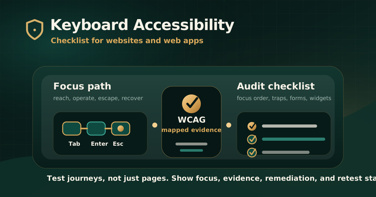
Quick answer: what is keyboard accessibility?
Keyboard accessibility means that a user can move through, understand, and operate a website or web app using a keyboard or keyboard-like input. This matters for people who cannot use a mouse, people using switch devices, speech input, screen readers, or other assistive technologies, and users who prefer keyboard workflows.
For a WCAG audit, keyboard accessibility is not only about whether the Tab key moves somewhere. The audit should verify that functionality can be reached, focus is visible, order is logical, controls work as expected, no keyboard trap blocks progress, and complete user journeys can be finished without pointer-only actions.
Why keyboard testing matters in audits
Keyboard issues often create hard blockers. If a user cannot open a menu, close a modal, select a date, submit a form, recover from an error, or complete checkout without a mouse, the digital service is not usable for many assistive technology users.
Automated tools can flag some focus and markup issues, but they cannot fully prove that a keyboard user can complete a workflow. Manual keyboard testing is therefore a core part of serious accessibility audits.
- Keyboard access affects people with motor disabilities, low vision, temporary injuries, and assistive technology workflows.
- Screen reader users often depend on keyboard commands and focus behavior.
- Complex widgets, overlays, forms, and authenticated workflows frequently fail keyboard testing.
- A page can pass many automated checks and still block keyboard-only task completion.
- Retesting is needed after remediation because focus behavior can regress easily.
Checklist area 1: reach every interactive control
Start by testing whether every important control can be reached without a mouse. This includes links, buttons, menus, form fields, upload controls, date pickers, tabs, accordions, dialogs, cards with actions, filters, pagination, carousels, and custom components.
The test should cover normal states and dynamic states. Many keyboard failures appear only after opening a modal, expanding a menu, triggering validation, changing filters, or moving through a multi-step journey.
- Use Tab and Shift+Tab to move through interactive elements.
- Use Enter, Space, arrow keys, Escape, and other expected keys where relevant.
- Confirm pointer-only controls have keyboard alternatives.
- Check hover-only menus, tooltips, popovers, and action cards.
- Test authenticated and role-based pages, not only public static pages.
- Document any control that cannot be reached or operated from the keyboard.
Checklist area 2: verify visible focus
Visible focus tells sighted keyboard users which element is active. If the focus indicator is removed, too subtle, hidden behind overlays, or visually disconnected from the active control, the user can lose their place.
WCAG includes Focus Visible and newer WCAG 2.2 focus-related criteria such as Focus Not Obscured. In audit reporting, visible focus findings should include screenshots or recordings because the issue is often visual and state-dependent.
- Every keyboard-operable control shows a visible focus indicator.
- Focus is not hidden by sticky headers, cookie banners, chat widgets, modals, or fixed footers.
- Focus style has enough contrast against the surrounding background.
- Custom components do not suppress browser focus without replacing it with an accessible visible style.
- Focus remains visible at different viewport sizes, zoom levels, and responsive breakpoints.
- Screenshots show the exact focused state that failed.
Checklist area 3: check focus order and meaning
Focus order should preserve meaning and operability. It does not always have to follow the exact visual layout, but it should make sense to a person moving sequentially through the interface.
Illogical focus order is common in responsive layouts, grids, cards, modals, mega menus, sticky headers, off-canvas navigation, and pages that visually rearrange content with CSS.
- Focus moves in a predictable sequence through the page or workflow.
- Focus does not jump unexpectedly to hidden, repeated, or unrelated content.
- Opening a modal moves focus into the modal, and closing it returns focus to a logical trigger.
- Dynamic content updates do not strand users in the wrong part of the page.
- Responsive layouts preserve a logical keyboard sequence.
- The audit records where focus starts, where it moves, and where the sequence breaks.
Checklist area 4: identify keyboard traps
A keyboard trap happens when focus enters a component and the user cannot move away using standard keyboard operation. This can occur in modals, carousels, embedded widgets, chat tools, maps, iframes, custom menus, or third-party components.
Keyboard traps are high-impact because they can stop a user from completing the journey or even leaving a component without reloading the page.
- Users can move into and out of every component using keyboard commands.
- Dialogs trap focus only while open and provide a keyboard-operable close path.
- Embedded tools do not capture focus permanently.
- Carousel, map, video, and chat components have predictable escape behavior.
- If special keyboard instructions are needed, they are visible and programmatically available.
- Retesting confirms that the trap is removed after remediation.
Checklist area 5: test forms and errors with keyboard only
Forms are where keyboard issues become business and service blockers. A user may reach a form but still fail if labels are unclear, error messages are not announced, focus does not move logically, or submission recovery depends on mouse-only interaction.
Test with realistic data, including empty submissions, invalid inputs, file upload states, password fields, OTP flows, payment steps, and multi-step forms.
- Labels, instructions, help text, and required states are reachable and understandable.
- Errors are keyboard discoverable and linked to the relevant fields.
- Users can review, correct, and resubmit without losing focus or entered data.
- Date pickers, dropdowns, autocomplete, upload controls, and comboboxes support expected keys.
- Submit, cancel, back, save, and continue actions are keyboard operable.
- Focus after validation supports recovery instead of creating confusion.
Checklist area 6: review custom widgets and web app patterns
Modern web apps often use custom controls instead of native HTML controls. That increases the risk of keyboard failures because developers must recreate expected keyboard behavior, focus management, roles, states, and accessible names.
A keyboard audit should test custom widgets in context, not only inspect code. The question is whether the component behaves predictably for a real keyboard user.
- Menus, tabs, accordions, dialogs, popovers, tooltips, and disclosure components have expected keyboard behavior.
- Comboboxes, date pickers, sliders, drag-and-drop tools, and grids provide keyboard-operable alternatives.
- Controls expose correct name, role, state, value, and instructions where assistive technology support is needed.
- Disabled, loading, selected, expanded, collapsed, and error states are communicated clearly.
- Keyboard shortcuts do not interfere with typing, screen reader commands, or browser behavior.
- Component-level fixes are retested wherever the component is reused.
What evidence should appear in the audit report?
Keyboard findings should be written so product and engineering teams can reproduce the issue. A vague statement like keyboard issue found is not enough for remediation.
The report should connect each issue to user impact, affected workflow, expected behavior, mapped criterion, and retest status.
- Affected URL, screen, component, document, or workflow.
- Keyboard steps to reproduce the issue.
- Expected behavior and actual behavior.
- User impact written in plain language.
- Mapped WCAG criterion such as Keyboard, No Keyboard Trap, Focus Order, Focus Visible, Focus Not Obscured, or related criteria.
- Screenshot or recording showing the focused state where useful.
- Recommended remediation and retest result.
Common mistakes to avoid
The most common mistake is checking only whether Tab moves through the page. Real keyboard accessibility includes focus visibility, order, operation, recovery, custom widgets, dynamic states, and complete journeys.
Another mistake is closing issues after a code change without retesting. Keyboard fixes can create new focus-order problems or fail in responsive layouts if they are not tested again.
- Removing browser focus outlines without a strong replacement.
- Making divs and spans clickable without keyboard support.
- Using custom controls where native elements would work better.
- Testing only the home page and ignoring modals, forms, dashboards, and authenticated flows.
- Ignoring third-party widgets that block the journey.
- Closing keyboard defects without evidence of retesting.
Practical recommendation
Treat keyboard accessibility as a journey test, not a page-level checkbox. Start with the workflows that matter most: login, search, forms, payment, account management, downloads, support, and any process that users must complete independently.
A strong audit combines manual keyboard testing, assistive technology context, standards mapping, clear remediation guidance, and retesting. That gives compliance teams evidence and gives delivery teams a practical path to closure.
Official references used
W3C WCAG 2.2: https://www.w3.org/TR/WCAG22/
W3C Keyboard Compatibility perspective: https://www.w3.org/WAI/perspective-videos/keyboard/
W3C Understanding 2.1.1 Keyboard: https://www.w3.org/WAI/WCAG22/Understanding/keyboard.html
W3C Understanding 2.4.3 Focus Order: https://www.w3.org/WAI/WCAG22/Understanding/focus-order.html
W3C Understanding 2.4.7 Focus Visible: https://www.w3.org/WAI/WCAG22/Understanding/focus-visible.html
W3C Easy Checks: https://www.w3.org/WAI/test-evaluate/preliminary/