
WCAG Criteria
Color Contrast Requirements Explained for WCAG AA
A practical guide to WCAG AA color contrast requirements, covering text contrast, large text, non-text contrast, exceptions, audit evidence, remediation, and retesting.
Quick answer: what are WCAG AA color contrast requirements?
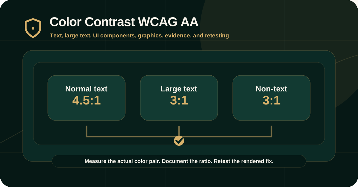
For WCAG AA, normal text and images of text generally need a contrast ratio of at least 4.5:1 against their background. Large-scale text and images of large-scale text need at least 3:1.
WCAG AA also includes non-text contrast requirements for important visual information such as user interface component boundaries, states, and graphical objects, which generally need at least 3:1 contrast against adjacent colors.
Why contrast matters
Color contrast affects whether people can read, identify controls, understand states, and complete tasks. Low contrast is especially difficult for people with low vision, color vision differences, contrast sensitivity loss, glare, aging-related vision changes, or mobile use in poor lighting.
Contrast is not only a design preference. In a WCAG audit, it becomes evidence that text, controls, and meaningful graphics are perceivable.
- People need enough contrast to read text and instructions.
- Controls need visible boundaries or indicators so users can identify what is interactive.
- States such as focus, selected, checked, error, disabled, or active need enough visual clarity where they convey information.
- Charts, diagrams, icons, and graphics need contrast when they communicate meaning.
- Contrast issues can block forms, navigation, purchase flows, dashboards, documents, and service journeys.
Text contrast: WCAG 1.4.3 Contrast (Minimum)
WCAG Success Criterion 1.4.3 Contrast (Minimum) is a Level AA requirement. It applies to the visual presentation of text and images of text.
The standard threshold is 4.5:1 for normal text, with exceptions for large text, incidental text, inactive UI components, decorative text, text not visible to anyone, text in pictures with significant visual content, and logotypes.
- Normal text: at least 4.5:1 contrast ratio.
- Large-scale text: at least 3:1 contrast ratio.
- Images of text follow the same threshold when the image is intended to be understood as text.
- Logo or brand-name text is exempt under the WCAG criterion.
- Inactive components and decorative text may be exempt, but the exception should be documented carefully.
Large text threshold
WCAG allows a lower contrast threshold for large-scale text because larger and thicker text is easier to read at lower contrast.
W3C defines large-scale text as at least 18 point regular or 14 point bold, with approximate CSS pixel equivalents discussed in the Understanding document. Auditors should avoid guessing and should check the actual rendered size, font weight, and context.
- Large text generally needs at least 3:1 contrast.
- Thin or unusual fonts may still be hard to read even if a numerical threshold passes.
- Image-based text should be avoided where real text can be used.
- Text in hover, focus, modal, menu, error, and tooltip states should also be checked.
- Do not round a failing 4.499:1 value up to 4.5:1.
Non-text contrast: WCAG 1.4.11
WCAG Success Criterion 1.4.11 Non-text Contrast is also a Level AA requirement. It applies to visual information needed to identify user interface components, states, and graphical objects.
This criterion is important because users need to identify more than text. They also need to see input boundaries, icons, focus indicators, charts, selected states, and meaningful visual controls.
- Input borders or visual boundaries where needed to identify the field.
- Buttons, checkboxes, radio buttons, switches, sliders, and toggles.
- Focus indicators and state indicators when they convey information.
- Icons and graphical objects that communicate meaning.
- Charts, graphs, diagrams, progress indicators, and status graphics where meaning depends on visual distinction.
Color contrast is not only about text
Many teams check body text and miss non-text failures. This creates a product that may pass some visible text checks while still being hard to operate.
A serious audit should test components and states, not only static copy.
- Placeholder text and helper text.
- Error text and validation messages.
- Disabled-looking controls that are actually active.
- Focus rings against backgrounds.
- Selected tabs, active filters, and checked controls.
- Icon-only buttons and graphical status indicators.
- Charts and data visualizations.
How auditors test contrast
Auditors measure contrast between the foreground and background colors that appear adjacent in normal presentation. For text, this means the text color against the background behind the text. For non-text items, this means the visual information against adjacent colors.
Testing should cover real states and responsive layouts because contrast can change across themes, breakpoints, hover states, focus states, overlays, dark sections, banners, cards, and disabled or selected states.
- Identify the exact text, UI component, state, or graphic.
- Capture foreground and background colors from rendered CSS or the design system.
- Measure the contrast ratio with a reliable contrast tool.
- Check whether normal text, large text, image text, non-text UI, or an exception applies.
- Document the measured ratio and required threshold.
- Retest the corrected color pair after remediation.
What evidence should appear in an audit report
Contrast findings should include enough evidence for designers, developers, content teams, and QA teams to reproduce the issue and verify the fix.
A vague finding such as low contrast is not enough for remediation.
- Affected URL, screen, component, document, or design-system token.
- Text, UI component, icon, chart, state, or graphic affected.
- Foreground and background color values where available.
- Measured ratio and required threshold.
- WCAG criterion and level.
- Screenshot or design reference.
- User impact, severity, remediation guidance, and retest requirement.
Common contrast failures
Contrast failures often come from brand palettes, inactive-looking active controls, subtle UI borders, overlays, image backgrounds, and placeholder text.
They also appear frequently in marketing sections, cards, badges, charts, forms, disabled states, focus styles, and PDFs.
- Light gray text on white or pale backgrounds.
- Gold, blue, green, or red text used without enough luminance contrast.
- Text over gradients or images without a stable background layer.
- Input borders that disappear against the page background.
- Focus indicators that are too subtle.
- Charts relying only on color differences.
- Brand-colored links that do not stand out enough from surrounding text.
Remediation guidance
Contrast remediation should be handled through design tokens and component systems wherever possible. Fixing individual pages one by one usually leaves recurring failures in the product.
The goal is to preserve the brand direction while creating accessible color pairs for real content and states.
- Create approved accessible color pairs for text, links, buttons, forms, badges, alerts, and charts.
- Use design tokens that include contrast-tested foreground and background combinations.
- Avoid placing text directly on complex images or gradients without a contrast-safe overlay.
- Strengthen focus, error, selected, active, and hover states.
- Provide alternate visual indicators in charts, not only color.
- Retest design-system changes across important components and pages.
Retesting contrast fixes
Retesting should confirm that the exact affected text, component, state, or graphic now meets the required threshold in the tested context.
A design update is not enough unless the rendered product, document, or component is verified.
- Original finding ID and affected component.
- New foreground and background values.
- Measured ratio after remediation.
- Screenshot or rendered-state evidence.
- Retest date and environment.
- Remaining risk if some states, themes, or documents are not yet fixed.
Common mistakes to avoid
Contrast is easy to oversimplify. Teams often check one color pair and assume the whole product is safe.
A better approach is to test the actual rendered content, important states, and design-system combinations.
- Checking only body text and ignoring UI states.
- Ignoring non-text contrast for controls and icons.
- Rounding failed ratios up to passing values.
- Assuming brand colors are exempt outside logos.
- Checking Figma colors but not rendered CSS.
- Missing contrast in PDFs, charts, screenshots, badges, and image text.
- Closing findings without retesting the exact affected color pair.
Practical recommendation
Treat color contrast as a system-level accessibility requirement. Build accessible color pairs into design tokens, components, templates, documents, and QA checks.
For audits, document the measured ratio, threshold, WCAG criterion, exception analysis, remediation direction, and retest result so the finding is actionable and defensible.
Official references used
W3C Understanding 1.4.3 Contrast (Minimum): https://www.w3.org/WAI/WCAG22/Understanding/contrast-minimum.html
W3C Understanding 1.4.11 Non-text Contrast: https://www.w3.org/WAI/WCAG22/Understanding/non-text-contrast.html
W3C WCAG 2.2 Quick Reference: https://www.w3.org/WAI/WCAG22/quickref/
W3C WCAG 2.2 Recommendation: https://www.w3.org/TR/WCAG22/
W3C Understanding 1.4.1 Use of Color: https://www.w3.org/WAI/WCAG22/Understanding/use-of-color