
WCAG Criteria
ARIA Mistakes That Commonly Fail Accessibility Audits
A practical guide to ARIA errors in custom controls, accessible names, hidden content, disclosures, and dialogs, with audit evidence and remediation guidance.
Quick answer: which ARIA mistakes matter in an audit?
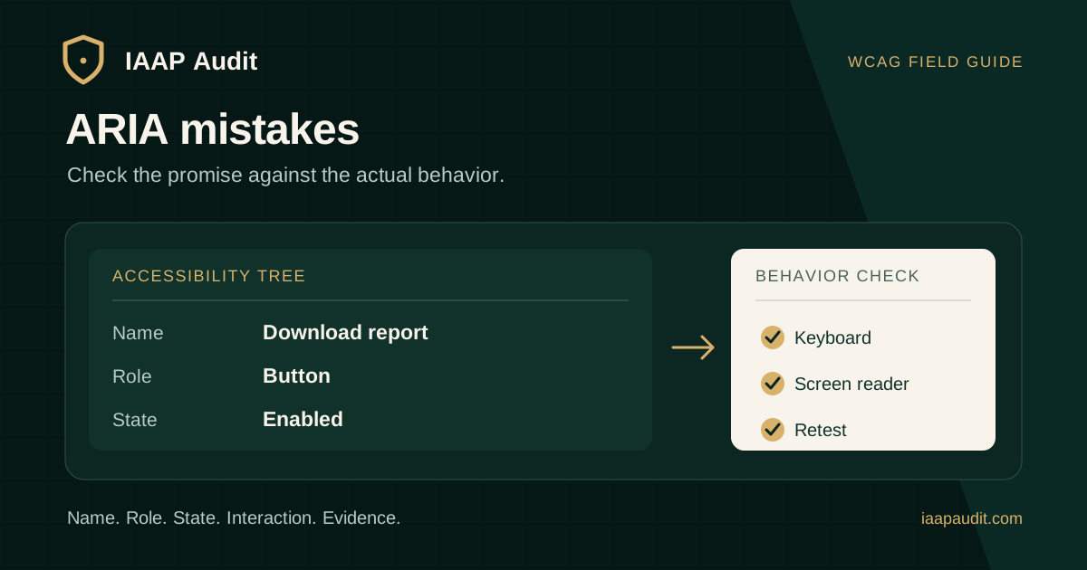
Accessible Rich Internet Applications (ARIA) attributes expose names, roles, states, and relationships to assistive technology. Problems arise when that information is absent, inaccurate, stale, or inconsistent with how a control actually works. An accessibility audit should inspect the rendered accessibility tree and exercise the interaction, not only search source code for ARIA attributes.
Common examples include a div labeled as a button that cannot be activated by keyboard, an icon button without a usable name, aria-expanded that stays false after a panel opens, or a focusable control inside content marked aria-hidden. The severity and Web Content Accessibility Guidelines (WCAG) mapping depend on the observed user impact.
What ARIA does and does not do
ARIA describes an interface to assistive technology. It does not, by itself, implement focus management, keyboard support, visual presentation, or application logic. A role of button on a generic element does not make that element respond to Enter or Space. The W3C ARIA Authoring Practices Guide calls a role a promise about the behavior the author must provide.
Start with a native HTML element when it offers the semantics and interaction needed. A button, link, input, or details element often avoids extra scripting and reduces the number of ways an accessibility state can drift from the UI. Complex custom widgets still need careful design, implementation, and testing.
Mistake 1: a role promises behavior the control lacks
Consider a clickable div with role=button. A screen reader may announce it as a button, yet a keyboard user might never reach it or be unable to activate it. The problem is the mismatch between the role and the real interaction, not simply the choice of element.
Prefer a native button for an action. If a custom control is necessary, test its focusability, expected keys, visible focus, and disabled or pressed states. Map the observed failure to the relevant criteria, such as WCAG 2.1.1 Keyboard and 4.1.2 Name, Role, Value, rather than assigning every ARIA mistake the same criterion.
Mistake 2: missing or misleading accessible names
An icon-only control may visually suggest Close, Search, or Download, while its accessible name is missing, a filename, or an unrelated string. A label can also override visible text and make voice input harder when the spoken name no longer matches the visible label. Where applicable, WCAG 2.5.3 Label in Name is another criterion to consider.
Inspect the computed accessible name in context. Prefer an actual visible label when it fits the design. When aria-label or aria-labelledby is needed, confirm that it identifies the correct element, remains accurate across states, and does not replace useful visible wording. A broken reference can leave a control unnamed or incorrectly named.
Mistake 3: states do not follow the UI
A disclosure button that opens a panel but keeps aria-expanded=false communicates a false state. The reverse is also a problem: announcing expanded when the controlled content is not available to the user. Similar mismatches can affect aria-pressed, aria-selected, aria-checked, and validation states when they apply to the chosen pattern.
Test every meaningful transition, not just the initial render. For a disclosure, open and close it with keyboard and pointer input, then check whether the content visibility and the exposed state agree. The W3C disclosure pattern describes a button whose aria-expanded value changes with the controlled content; its aria-controls relationship is optional in that pattern.
Mistake 4: hiding content that still receives focus
aria-hidden=true removes an element and its descendants from the accessibility tree. It does not by itself remove links or buttons from keyboard navigation. A focusable child can therefore receive focus while having no useful announcement. This often happens in collapsed mobile menus, off-canvas panels, and background content around overlays.
Inspect the live page after state changes. Ensure hidden content is both unavailable to assistive technology and not reachable when it should be inactive. Do not apply aria-hidden to an ancestor containing a visible interactive control or the active dialog. Choose a hiding and focus strategy appropriate to the component, then verify its actual behavior.
Mistake 5: a dialog is modal in name only
Declaring aria-modal=true does not prevent interaction with the page behind an overlay. A dialog also needs a meaningful name and suitable keyboard focus behavior. In the W3C modal dialog pattern, focus moves into the dialog when it opens, Tab stays within its controls, Escape closes it, and focus generally returns to the invoker when it closes.
Audit the whole journey: opening, reading, completing or cancelling, and returning to the page. Check that underlying content is inert while the dialog is active. Do not label a dialog modal when users can still interact with the page behind it. Some dialog focus choices depend on content length and workflow, so report the actual barrier rather than enforcing one arbitrary first-focus target.
Mistake 6: ARIA overrides useful native semantics
Adding a role to an HTML element can replace what assistive technology would otherwise understand. For example, assigning a conflicting widget role to a link may change its announced type even though it still behaves like a link. Adding an unnecessary aria-label can also replace meaningful text with a less informative name.
Compare the native markup, computed role and name, visible label, and actual action. Remove unnecessary overrides when the native element already communicates the right meaning. Check the W3C ARIA in HTML specification when a role or attribute is being added to a particular element.
How should an accessibility audit test ARIA?
Select representative journeys and shared components: navigation, search, forms, accordions, tabs, dialogs, alerts, and account actions. Automated tools may detect invalid attributes or some missing names, but they cannot establish that a spoken state matches the visible state or that a promised interaction works for a user.
Check the accessibility tree, then navigate with keyboard and an appropriate screen reader. Include loading, success, error, open, closed, and responsive states where relevant. Reproduce the task a user needs to complete.
- Record the URL, viewport, component, state, browser, and assistive technology used.
- Capture the exposed name, role, state, or relationship, plus the corresponding visible UI.
- Use keyboard navigation and activation to confirm the control fulfills its role.
- Test what changes after opening, closing, selecting, submitting, or navigating.
- Separate a standards failure from an authoring improvement that is useful but not itself a confirmed WCAG violation.
What should the report and remediation plan include?
A useful ARIA finding identifies what was announced, what the control actually did, the user consequence, and the criterion supported by that evidence. For example, if a collapsed menu's link remains keyboard focusable but hidden from assistive technology, include the menu state, keystrokes, inaccessible focus target, and the impact on navigation.
Fix the source component where the defect repeats. Prefer native controls where they fit. When a custom widget is required, make its state derive from the same source of truth as its visible behavior. Retest the original finding and a sample of other pages using the component before closing it.
- Finding ID, affected pages or shared component, and reproduction steps.
- Observed accessible output, keyboard result, visible state, and expected behavior.
- User impact, severity rationale, WCAG criterion and level, and remediation direction.
- Retest environment, before-and-after evidence, and any remaining limitation.
Common questions about ARIA audits
Does adding ARIA make a component accessible? No. The role and state must accurately describe a component that can be operated and understood through the relevant input methods.
Is every ARIA lint warning a WCAG failure? No. Confirm the rendered behavior, user impact, and applicable success criterion. Some warnings point to code quality or a pattern risk rather than a demonstrated conformance failure.
Can an automated scan replace manual ARIA testing? No. Dynamic states, focus behavior, keyboard operation, and the meaning of names need contextual review.
Official references
W3C ARIA Authoring Practices Guide, Read Me First: https://www.w3.org/WAI/ARIA/apg/practices/read-me-first/
W3C ARIA in HTML: https://www.w3.org/TR/html-aria/
W3C Understanding WCAG 4.1.2 Name, Role, Value: https://www.w3.org/WAI/WCAG22/Understanding/name-role-value.html
W3C ARIA disclosure pattern: https://www.w3.org/WAI/ARIA/apg/patterns/disclosure/
W3C ARIA modal dialog pattern: https://www.w3.org/WAI/ARIA/apg/patterns/dialog-modal/
W3C ARIA accessible names and descriptions: https://www.w3.org/WAI/ARIA/apg/practices/names-and-descriptions/
W3C Understanding WCAG 2.1.1 Keyboard: https://www.w3.org/WAI/WCAG22/Understanding/keyboard.html
Prepare custom components for review
List the shared controls your users depend on, their expected states, and the user tasks they support. Include mobile and error states so reviewers can test more than a static screen.
IAAP Audit can assess those components within a scoped accessibility audit, document behavior and standards mapping, and retest the affected journeys after fixes are delivered.